Brand Story – State Bank of India
This largest public sector bank of India has a rich history that dates back to the pre-independence era. The bank’s logo has taken a similar journey from shedding its imperial roots to developing into a symbol of the safety of finances the common folk of this country have come to reckon with.
 The birth of SBI can be traced to 1921 when the British government amalgamated the three Presidency banks (Bengal, Bombay and Madras) into the Imperial bank of India. The logo was a simple circle containing the English court of arms as a representation of the imperial authority over the currency of British India.
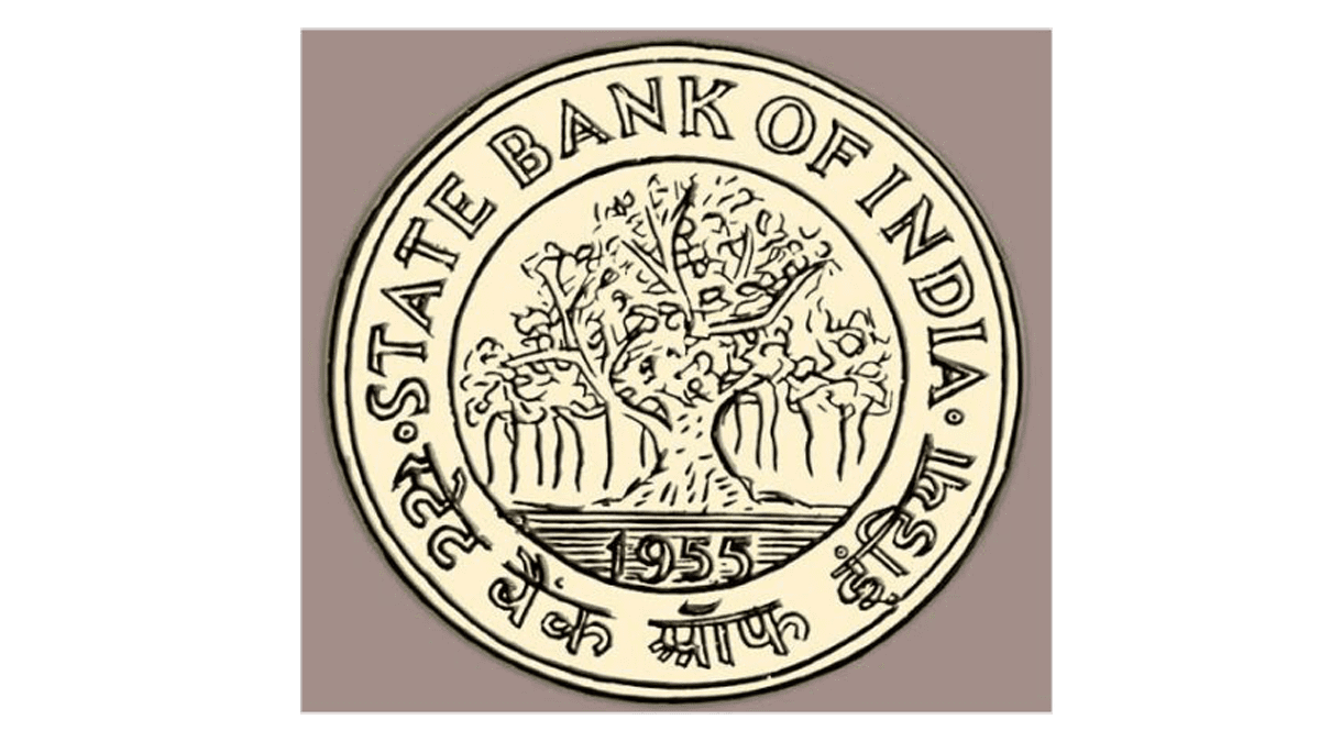
With the advent of the independence of India the Imperial bank was then taken over by the government by the State Bank of India Act, 1955 and hence given its current name, i.e., State Bank of India. The first logo of the SBI was starkly different from what is seen today. It contained a banyan tree within an outer ring that contained the Bank’s name. The sacred Banyan Tree is also known as the tree of life in the ancient texts and is a symbol of longevity and growth. Hence, the usage of the banyan tree as the logo was an attempt to express the characters of the bank that are in tandem with that of the tree. The roots of a banyan tree are known to be sturdy and deep which is a reference to the strength and stability of the bank. Furthermore, the stout shoot of the tree is growing in all directions as a significance of growth and success of the bank .
 The banyan tree adorned the State Bank logo for roughly fifteen years after which it underwent a rebranding in 1971. This new logo was a complete hundred and eighty degree turn from the previous one in terms of visuals. The new logo is simply a blue circle with a gap at the bottom. The designer of the logo, Shekhar Kamat who is an alumnus of National Institute of Design, Ahmedabad, took inspiration from Kankaria Lake in Ahmedabad to make the State Bank logo. Interestingly, while the new logo has been in use since 1971, it was first officially registered as a trademark in the year 2005.
While a minimalistic approach to the visual appeal has been taken, the meaning of the design has multiple interpretations. Firstly, it looks like a keyhole, so as to signify that the bank safely protects the wealth of the people of the nation. Secondly, the gap in the bottom of the circle looks like a narrow lane. This is a nod to the reach of the bank to signify that it serves people in the smallest towns in the country. Moreover, the small circle in the centre together with the straight line together looks like a stick figure. This puts the message forwards that even if it is a large bank, the common man is at the centre, always.

Today, SBI stands true to its tagline as it has become the banker to every Indian. It is the most reliable bank that the ever-growing middle class of the country has come to trust. The same trust is resonated by the logo of the bank. A simplistic and easy to remember concept engraves itself in memory effortlessly. It has since become the face of stability and growth for the country’s oldest commercial bank.


